1. Problem statement
Creatives find it hard to give, receive, and collect feedback because of decentralized community.
2. Users & audience
Young artists living creative lifestyles in large metropolitan cities.
3. Roles & responsibilities
Designer & project manager, was responsible for designing the service from end to end.
4. Scope & constraints
Build, launch, test, and iterate an MVP with an extremely small budget in under 5 months.
5. Our Process
Design thinking merged with lean methods and an agile development approach.
6. The Result
Launched a successful MVP, that has been tested twice and is ready for user onboarding.
1. The Problem
Three years and few survey/interview respondents later we learned that underground musicians are experiencing some painful problems.
Millions of underground musicians are not able to easily move through the creative process because the review of music in development is made hard by a feeling of
isolation within the creative ecosystem. Our number one goal with this project was to make the ideation, production, and testing of creative work easier for both underground and established musicians.
isolation within the creative ecosystem. Our number one goal with this project was to make the ideation, production, and testing of creative work easier for both underground and established musicians.
2. The User & Audience
Underground musicians living a creative lifestyle in large cities with bustling music scenes are looking for easier ways to build their creative network while giving, receiving, and collecting usable feedback.
There many different types of musical creatives, some are just starting and have no creative network, others are more established and have a well defined creative circle. While not everyone is interested in the critique of their work, for many musicians critique, and the feedback received through the process offers priceless insights into not just their work but their creative process.
Sample Personas

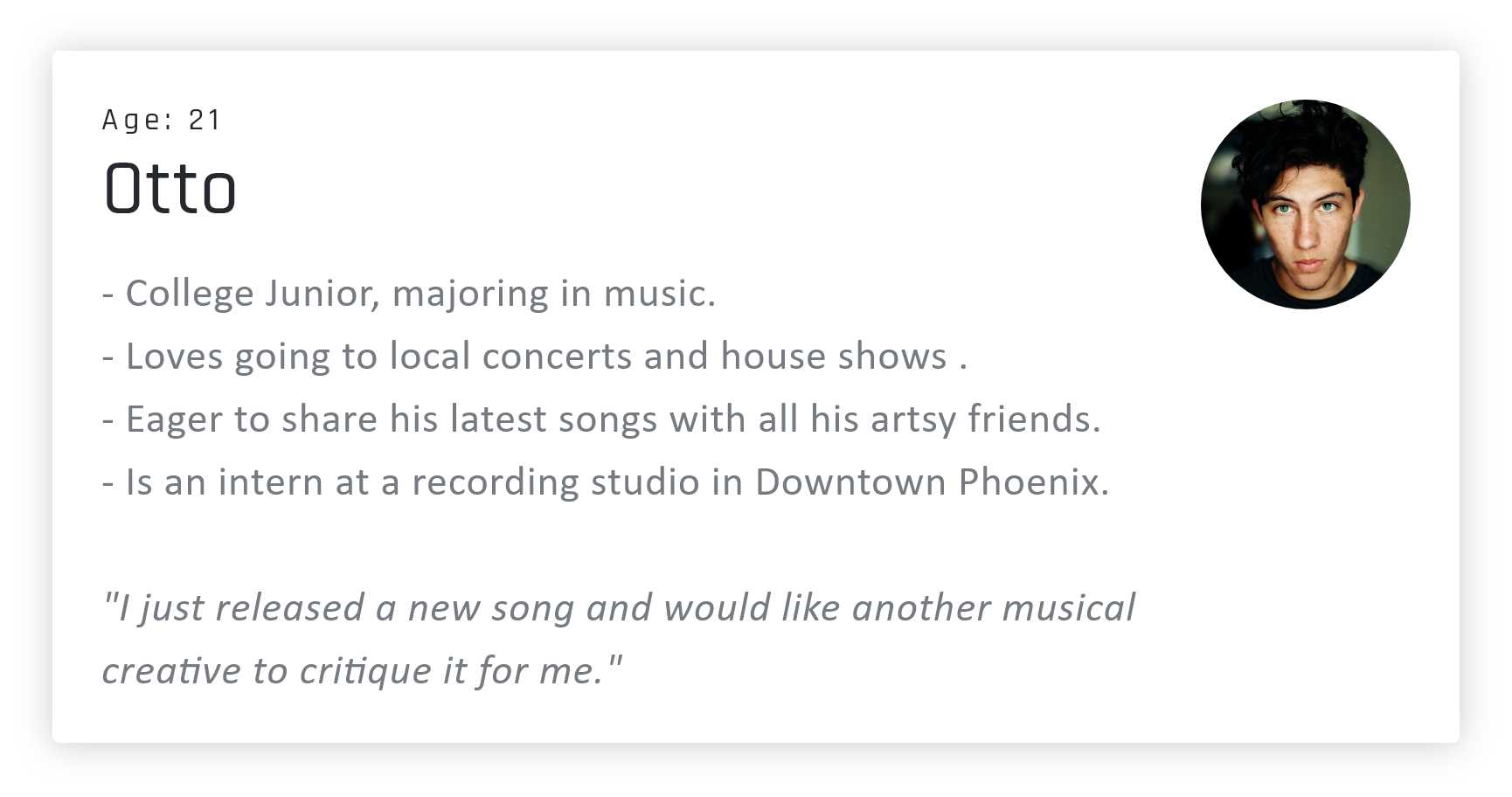
Before we began the build and release of the Crithub web app we learned through our market research that our target audience were young underground musicians between the ages of 16-32. By targeting potential users in this age range we were able to connect with musicians that were actively looking for someone to critique and provided feedback on their work. Demographic and psychographic research conducted through observational methods helped us further determine that the ideal segment of users were highschoolers and young adults living creative and artsy lifestyles in large metropolitan cities with a bustling music scene. We also learned, established artists are looking a seamless way to receive and collect feedback in their creative circle.
3. My role & responsibilities
An idea born out the many problems we saw musical creatives dealing with as we worked on Mood music.
There currently are three of us working on the product and we are based in Tempe Arizona. Throughout the creation of Crithub and as a founding member I taken on many different roles, ranging from business administration to marketing to design. My teammates Sam and Luis are handling the programming while I focus on product and UX/UI design. So far, I have conducted market research, user interviews, created user personas, identified challenges and pain points, facilitated the ideation process, drafted sketches, user flows, low fidelity prototypes, high fidelity prototypes, conducted usability test and made iterations to previous designs based on data.
4. The Scope & Constraints
Mood was my first-ever startup, we were bootstrapped and learned to iterate rapidly
through the insights we gathered with user testing.
through the insights we gathered with user testing.
Crithub has been regarded as unique by our business mentors, friends, and by the musicians we have tested our prototype with. Our pursuit with regard to the creation of this project is also noteworthy because we are attempting to solve complex problems surrounding the creation of successful music and artist growth as a bootstrapped startup. As my third attempt in building and launching a digital product I'm surprised by the practical knowledge I have gained through previous projects, and how quickly we have been able to design, develop, and launch by applying that knowledge. The timeline for the first version of CritHub was four months, september through december of 2019. In this time period we were successfully able to bring a MVP to market despite being constrained by a small budget, and being full time students that also work as full time employees. We accomplished this by building a product requirements document, by keeping our backlog up to date and holding weekly meetings to check in on design and development progress. Every two weeks we would ship a feature from the previous sprint and pull tasks from the backlog and place them into our todo pile for the next sprint, we
kept track of progress and performance with story points and by tracking our current state with a doing and done pile.
First we empathized with our users by conducting interviews and surveys that sought to understand in an unbiased way the problems underground musicians faced. After analyzing the qualitative data we collected from our 11 users interviews and the quantitative data we collected from 20 survey respondents we defined the scope of the project and identified key pain points, challenges, and solidified our user personas.
First we empathized with our users by conducting interviews and surveys that sought to understand in an unbiased way the problems underground musicians faced. After analyzing the qualitative data we collected from our 11 users interviews and the quantitative data we collected from 20 survey respondents we defined the scope of the project and identified key pain points, challenges, and solidified our user personas.
Following the definition of the problem we moved into an ideation phase where we sketched out and explored proposed ideas. Eventually we voted on a solution and I drafted sketches, a user flow, low fidelity prototypes, high fidelity prototypes, conducted usability tests and made iterations to previous designs based on data. Finally after working through google's design sprint we launched an MVP that we built using an agile development approach. This project is ongoing, we continue iterate & travel through the process.
5. My Process
We conducted a few surveys and interviews and found out our users needed a simpler way to give, receive, and collect feedback.
User Surveys
We began the development process for this product with user surveys. The goal of these surveys was to collect quantitative and qualitative data that would yield statistical insights we could evaluate to uncover problems and pain points faced by musicians. We also tested our hypothesis (Growing as an artist is hard because it is challenging to receive quality feedback.) against the collected data to either confirm or disprove perceptions we had about which solutions would provide the most value to musicians. Our primary audience for these surveys were college-aged musicians interested in growing their careers. We conducted these surveys by personally sending them to musicians we already had relationships with and encouraged them to share the surveys with their fellow creatives. Questions on our survey included, “How often are you trying to grow as an artist” to which 57.1% of respondents said all the time, 28.6% said some of the time, and 14.3% said almost never. We also asked demographic questions like “What type of community do you live in?” 83.3% of respondents said they live in a City or Urban setting. 16.7 % said they live in a suburban setting. 0% said they live in a rural setting. We had a total 20 respondents across two surveys and learned that those living in cities are trying to grow their careers but find it challenging to do so.
Interviews
We direct messaged musicians on social media that fit our user personas to conduct user interviews. We conducted the first round of interviews via video chat The second round of interviews were conducted face to face after the release of our MVP. In the first set of interviews we asked our interviewees questions designed to uncover the challenges they faced as an underground musician. For example, we asked questions like “How do you currently go about growing as an artist?” The purpose behind a question like this was to gather insights about how our target audience currently goes about growing themselves. We also asked questions like "When was the last time you had problem growing as an artist?" The goal of questions like this was to further understand the issues and pain points our users experienced with regard to their growth solutions.
After the launch of our minimum viable product we proceeded to conduct another round of interviews that focused on usability of the first version of our MVP. By conducting these
interviews we learned that we needed to improve the navigation within our web app so using it would be more intuitive. We also found that we needed to improve the in app communication so the tasks users could perform were more clear. Finally, we learned that most users did not understand perform were more clear. Finally, we learned that most
users did not understand the point system we used throughout the product. After redesigning navigation within the app, improving the visual communication, and making the point system clear we were able to significantly improve the user experience.
We have a few competitors, none of them are focused on building strong creative communities by helping musicians give, receive, & collect feedback.
MURAL enables innovative teams to think and collaborate visually to solve important problems. Kollaborate provides Instant real-time feedback from colleagues and clients. CritViz is a web-based tool for classrooms, designed to support the practice of student peer-critique. Talentopedia is a Growth Platform for creative talent. They empower creatives with their app. The issue with each of these products/services is that none of them are hard focused on musicians or artistic creatives and helping them give, receive, or collect feedback easily while also building their creative network..
As a Musician, I have a problem receiving valuable feedback I can use to improve my work, this made challenging by weak community.
“As an artist, I want better or more contact with people that can change my life; I don't have access to people in the industry” - Richard.
“ Sometimes I feel really lost as an artist, and it can be hard to make growth happen when people don’t take me seriously. ” - Elle.
“As an artist, I try to grow through feedback and listen to it. I Use social media to find people I want feedback from, I also keep up with hashtags.” - Derrick
We discovered the largest pain point faced by underground musicians is how difficult it was to move through the creative process because the testing of music in development is made hard because of a feeling of isolation within the creative ecosystem. Our number one goal with this project is to grow creative networks and make the ideation, production, and testing of creative work easier for both underground and established musicians.
Empathy Map
The empathy map we created was designed to visually display the knowledge we gained from our users through interviews & surveys. By building this empathy map my team and I were able to better understand and visualize the needs of or users through their emotions and behaviors.
Below is a digital version of the user journey I created as my team and I moved through our design sprint.
Sketches
The user flow I designed illustrates how our users complete various tasks within the Crithub web app, it also shows how each step relates to another. By building this user flow, I was able to identify which steps could be eliminated, added to or improved.
User Flows
The user flow I designed illustrates how our users complete various tasks within the Crithub web app, it also shows how each step relates to another. By building this user flow, I was able to identify which steps could be eliminated, added to or improved.
Low Fidelity Wire-frames
The wireframes I designed were created to arrange elements in a way that accomplished a particular purpose. Each of the various wireframes depicted page layout, arrangement of the apps content, interface elements, and navigational systems.
The wireframes to the right are first version iteration of wirefames I designed. After review we chose to move in a different direction with the design.
The wireframes to the right are first version iteration of wirefames I designed. After review we chose to move in a different direction with the design.
High Fidelity Wire-frames
The wireframes to the left are high fidelity versions of the final wireframes I designed. These wireframes became the foundation for the final design.
Feedback is never more than a response away. A public feed lets users receive feedback from around the world while private links keep feedback In their creative circles, and a reddit-like thread builds community.
We made the process of growing creative networks, giving, collecting, and receiving valuable feedback seamless through four key features. The first and most important feature is the public feed, the public feed is random for all users, and anyone can choose to share their work on it. Because the feed is random and reset frequently it promotes equality in the discovery of work. When users respond to other musicians they earn points that they can use later to post their own work to the feed. The Public feed also gives users contact info for other musicians, they can use this information to connect and grow their creative network. The second feature is geared toward the receiving and collection of feedback. In the user's library we store all the feedback they have received with the song, they can access this feedback at any time by clicking on an upload. We also made it possible for people to share music privately with a shareable link, this allows more established artists to share their work with only their creative circle, but still allows them to take advantage of our core feedback organization and collection features. Most recently we built a reddit like thread into the app so users can engage in fluid conversation that promotes community building and more extensive feedback.
The Final Design
To the left is the final design for Crithub. I arrived on this design after much usability testing. Research into UI/UX best practices and Google Material also influenced the design and its outcome.
This design is redesign of the original Crihub aka Mood for artists. We chose to redesign after testing our prototype and learning that navigation and core functions were unclear to users.
VISIT SITE VIEW PROTOTYPE
This design is redesign of the original Crihub aka Mood for artists. We chose to redesign after testing our prototype and learning that navigation and core functions were unclear to users.
VISIT SITE VIEW PROTOTYPE
CritHub 1.0
To the right is the first version of Crithub, originally called Mood for Artists. After poor performance in usability tests this design was scraped.
Crithub Enterprise
After meeting with BMP Supreme at their Los Angeles office we had a validated learning experience that confirmed their was room for Crithub to offer extreme value at the enterprise level.
As a result of these insights I went on to design an onboarding process & account management system for our future enterprise clients.
As a result of these insights I went on to design an onboarding process & account management system for our future enterprise clients.
6. The Results
We launched our MVP, made changes & relaunched, now we're on-boarding new users & testing a ton!
We are still working hard to improve the CritHub web app and take it to the next level. So far we have been successful in launching two versions of our MVP and have started helping a moderate number of musicians give, receive, and collect feedback. Because the project is still in its infancy we are constantly conducting usability testing and making iterations as such. Unlike the Mood we built CritHub with an immediate business model that did not require users as a prerequisite to revenue generation. In the future we intend
to expand CritHub into an critique platform that is not just for musical creatives but for all creatives. Our decisions to do this is based on the many requests we have received from other creatives to make this product available to them. All this said the CritHub Team and I are excited to onboard more users and continue testing the service.
