1. Problem statement
Creating genuine human connections has become challenging with technology.
2. Users & audience
Young people living adventurous lifestyles in cities & urban settings around the world.
3. Roles & responsibilities
Designer & project manager, responsible for designing the user interface and experience.
4. Scope & constraints
Build & launch an MVP in a semesters time frame with a team that has never worked together.
5. Our Process
Design thinking merged with lean methods
and an agile development approach.
and an agile development approach.
6. The Result
Launched a successful MVP, that has undergone testing & was showcased to faculty.

1. The Problem
A shared problem among fellow students and interview respondents. Young people find it very
hard to create genuine human relationships.
hard to create genuine human relationships.
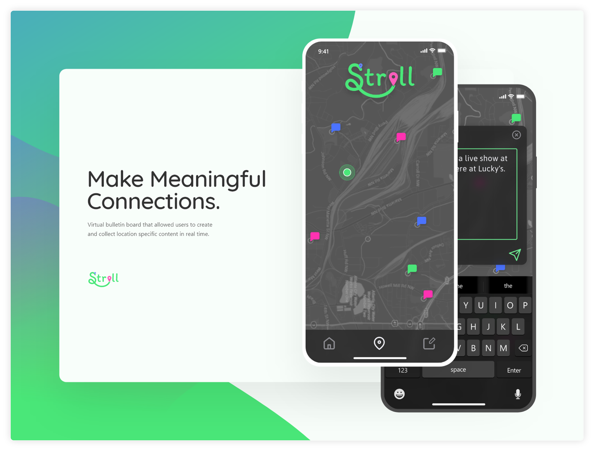
It is becoming increasingly difficult to form genuine human connections. There is also a growing gap that exists as a result of the disconnect created by our current social media culture. Stroll was designed with the intention to make the formation of genuine human connections easier for people living in our technological society.

2. The User & Audience
Young people living adventurous lifestyles in cities and urban settings who are looking for ways to build connections and connect with local communities.
People around the world crave the connection that can be had between two humans. However, as technology continues to work its way further into our lives there is a specific group of people looking to build meaningful connections. This group of people enjoys traveling, engaging with their community, and meeting new people.
Sample Personas
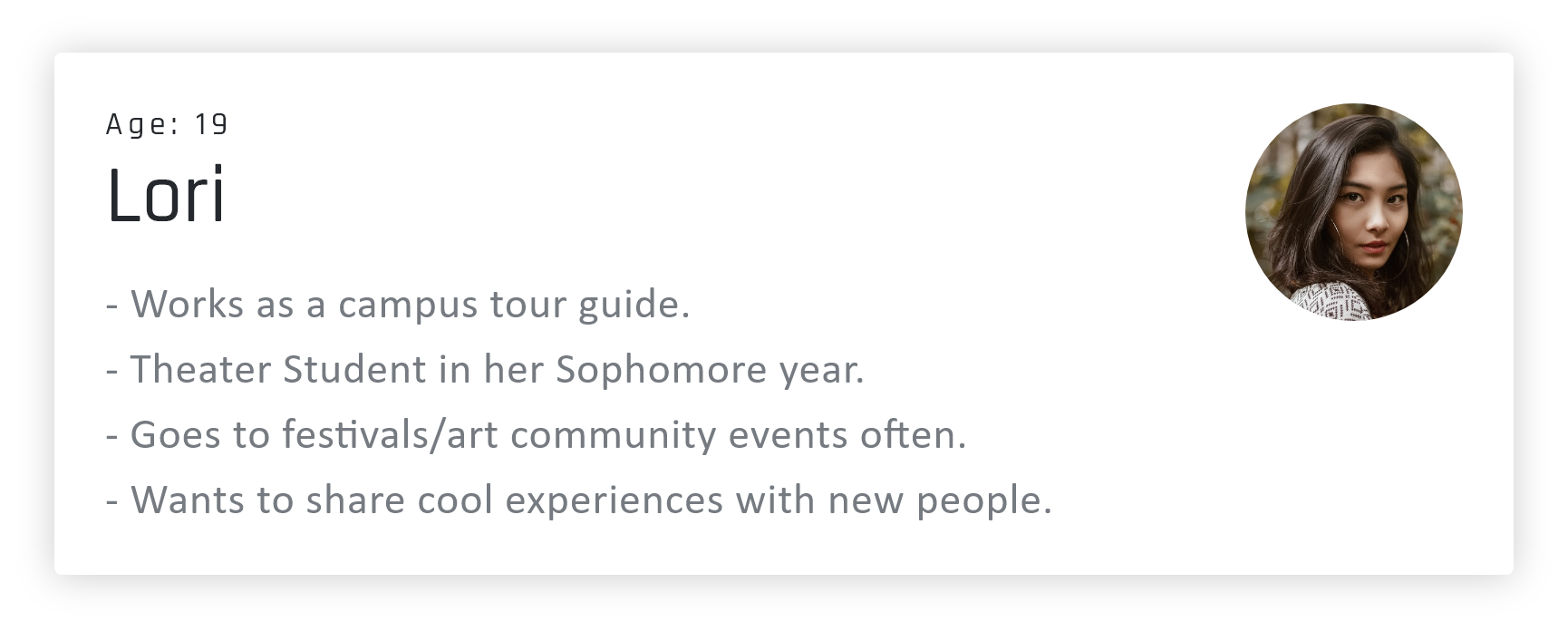
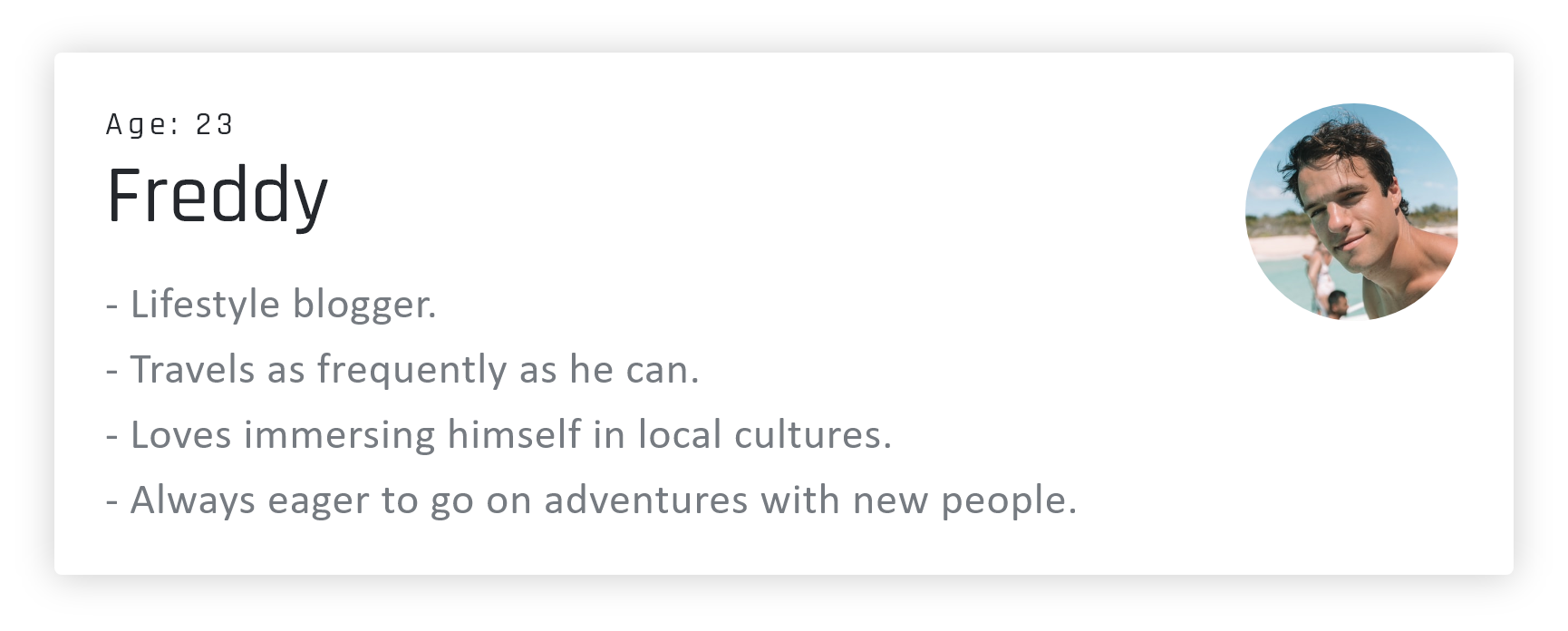
Before we began the build and release of the Stroll app we learned through market research that our target audience was young adults between the ages of 18-25. By targeting potential users in this age range we were able to engage with people who were actively looking to connect with their communities and build more genuine human connections. Demographic and psychographic research conducted through observational methods helped us further determine that the ideal segment of users were college-aged students and young adults living adventurous lifestyles in large cities and urban settings.

3. My role & responsibilities
Inspired by the challenges associated with community and relationship building in the information age.
Technology should be built to help facilitate genuine human connections. Many current technological creations disconnect and isolate users from the real world. Stroll was different in that we attempted to bring reality into virtual experiences. Our team consisted of four members. I took on the role of PM/designer. I guided our team through the product development cycle, I also designed the UI/UX. Taryn, our software architect coded a large portion of the app’s infrastructure. Linda, our developer/designer designed the logo and developed the backend. Taylor, our quality engineer documented Stroll & tested each iteration. Collectively, the product development team worked well together and was able to deliver a well-designed, functioning minimum value product in three months time.

4. The Scope & Constraints
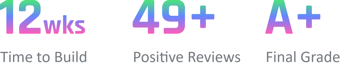
Stoll was my first Capstone project, we experienced setbacks, learned a lot, and achieved big goals.
Stroll was regarded as unique by our professors, friends, and fellow classmates whom we tested our prototype with. Our pursuit with regard to the creation of this project is also noteworthy because we were attempting to solve complex problems surrounding human connection with an unfunded capstone project in semesters time. As my second attempt at building and launching a digital product I'm surprised by the practical knowledge I have gained through previous projects, and how quickly we were able to design, develop, and launch our MVP by applying that knowledge. The timeline for Stroll was 14 weeks to which we had to adhere to strict deadlines. In this time period, we were successfully able to bring an MVP to market despite being constrained by a short timeline and team that had never worked together before. We accomplished this by keeping our backlog up to date and holding weekly meetings to check in on progress. Every two weeks we would ship a feature from the previous sprint and pull tasks from the backlog into our todo pile for the next sprint, we kept track of progress and performance with story points and by tracking the current state with a doing and done pile. First, we empathized with our users by
conducting interviews that sought to understand inan unbiased way the problems faced by people looking to create genuine human connections with other people. After analyzing the qualitative data we collected from our user interviews we defined the scope of the project and identified key pain points, challenges, and solidified our user personas. Following the definition of the problem, we moved into an ideation phase where we sketched out and explored proposed ideas. Eventually, we voted on a solution and I drafted sketches, a user flow, low fidelity prototypes, high fidelity prototypes, conducted
we sketched out and explored proposed ideas. Eventually, we voted on a solution and I drafted sketches, a user flow, low fidelity prototypes, high fidelity prototypes, conducted usability tests and made iterations to previous designs based on data. Finally, after working through a few sprints we launched an MVP that we built using an agile development approach. This project ended at the end of the semester and was not taken further due to majority of the team graduating and moving on to pursue other opportunities.

5. My Process
We conducted interviews and learned that many college students felt isolated and found it challenging to meet new people.
User Interviews
We reached out to fellow classmates and other members of Arizona States student body to conduct user interviews. We conducted one round of interviews in-person and asked questions related to the user and what they found challenging about their college experience. Every interview was started by asking the user's questions about their day-to-day lives, their hobbies, and their passions. The purpose behind asking these questions was to warm up the interviewee and get them comfortable with the interview process. Following the first set of questions, we proceeded to ask our interviewees questions designed to uncover the challenges they faced in colleges. For example, we asked questions like “How do you currently go about meeting new people?” We also asked questions like "What do you find most challenging about college?" The goal of these questions was to further understand the issues and pain points our users experienced. After conducting this set of interviews we felt comfortable moving into the ideation phase, from there we began drafting potential solutions to their problems.

Remain uncomfortable or be overly trusting, these are risks associated with building genuine connections today.
To build genuine human connections in today's society one must reach out to people they don't know, this can be a very uncomfortable activity. Alternatively one can meet someone through social media, an online chat room or dating app and then connect with them in person. Each of these solutions build human connections however, they are not the most seamless ways to do so, and the solutions offered present a risk factor that requires significant trust.

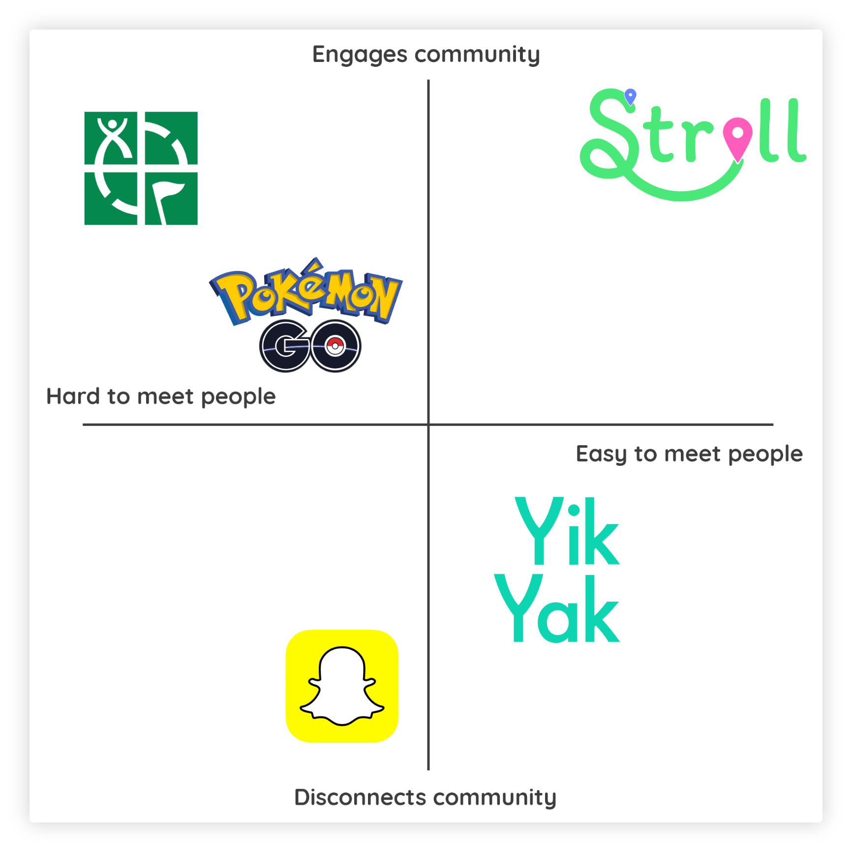
Most companies focus on creating more connections. We took a different route and focused on using technology to facilitate genuine human relationships.
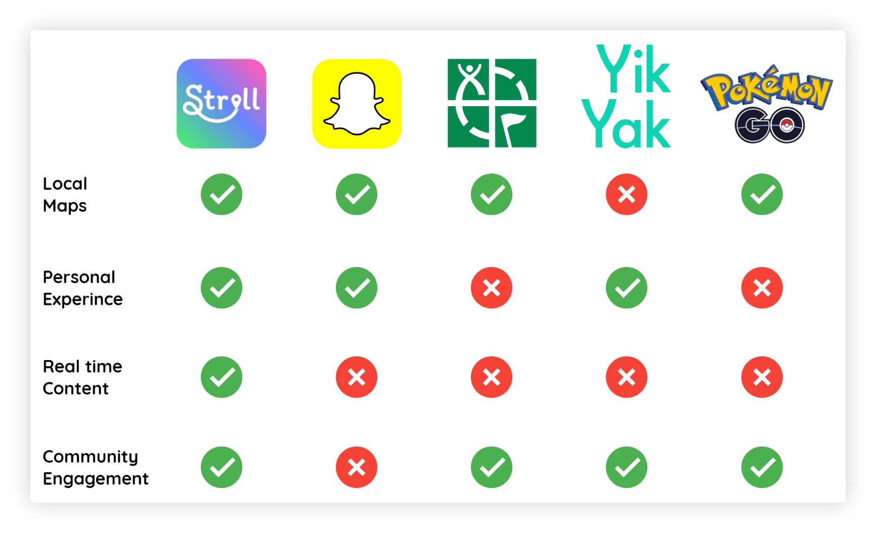
The following platforms were considered our competitors, yet none of them used technology to facilitate genuine human connections through the services or experiences they provided. Nintendos Pokémon GO comes close to what we did at Stoll. However, they did not allow for user-generated content whereas Stroll was centered around it. Another related project was Yik Yak, which allowed users to view posts within a 5-mile radius. Yik Yak lacked the engaging and intuitive map interface we offered, also, the content was limited to text only. On the Stroll platform, the radius was much smaller and we tailored the content to be specific to the user. Unlike Pokémon GO, Snapchat & Geocache, Stroll did not hide content.

As a human, I want to create more genuine connections so I can add more meaning to my life. This is hard because technology has created a wall.
We discovered the largest pain point faced by our target audience was, that it has become extremely difficult for them to form genuine human connections as technology integrates itself further into their lives.
Our top goals were to build a meaningful and scalable product capable of creating future opportunities while also launching a service that helps facilitate the creation of more genuine human connections.

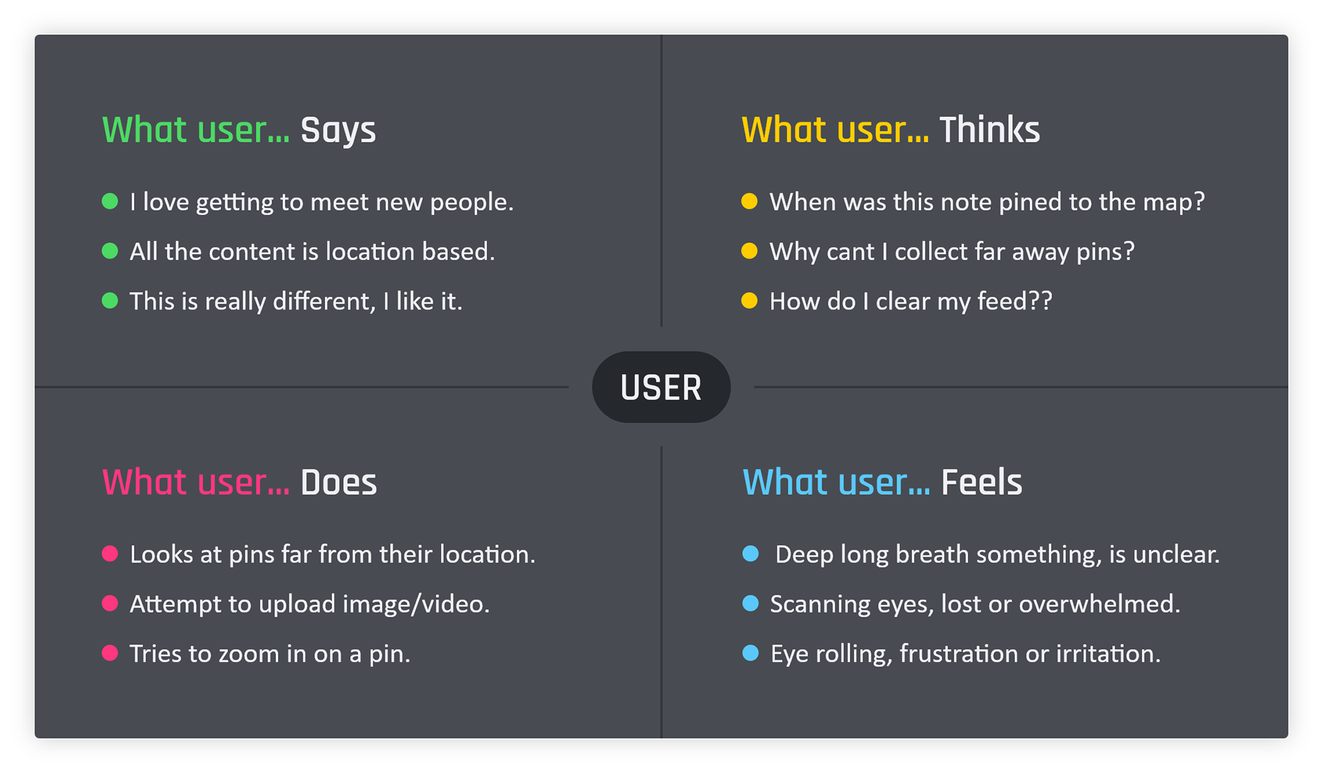
Empathy Map
The empathy map we created was designed to visually display the knowledge we gained from our user through interviews and surveys. By building this empathy map my team and I were able to better understand and visualize the needs of or users through their emotions and behaviors.

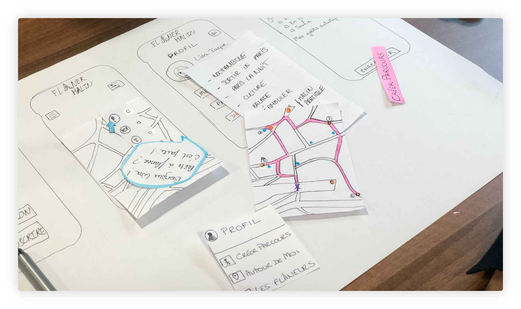
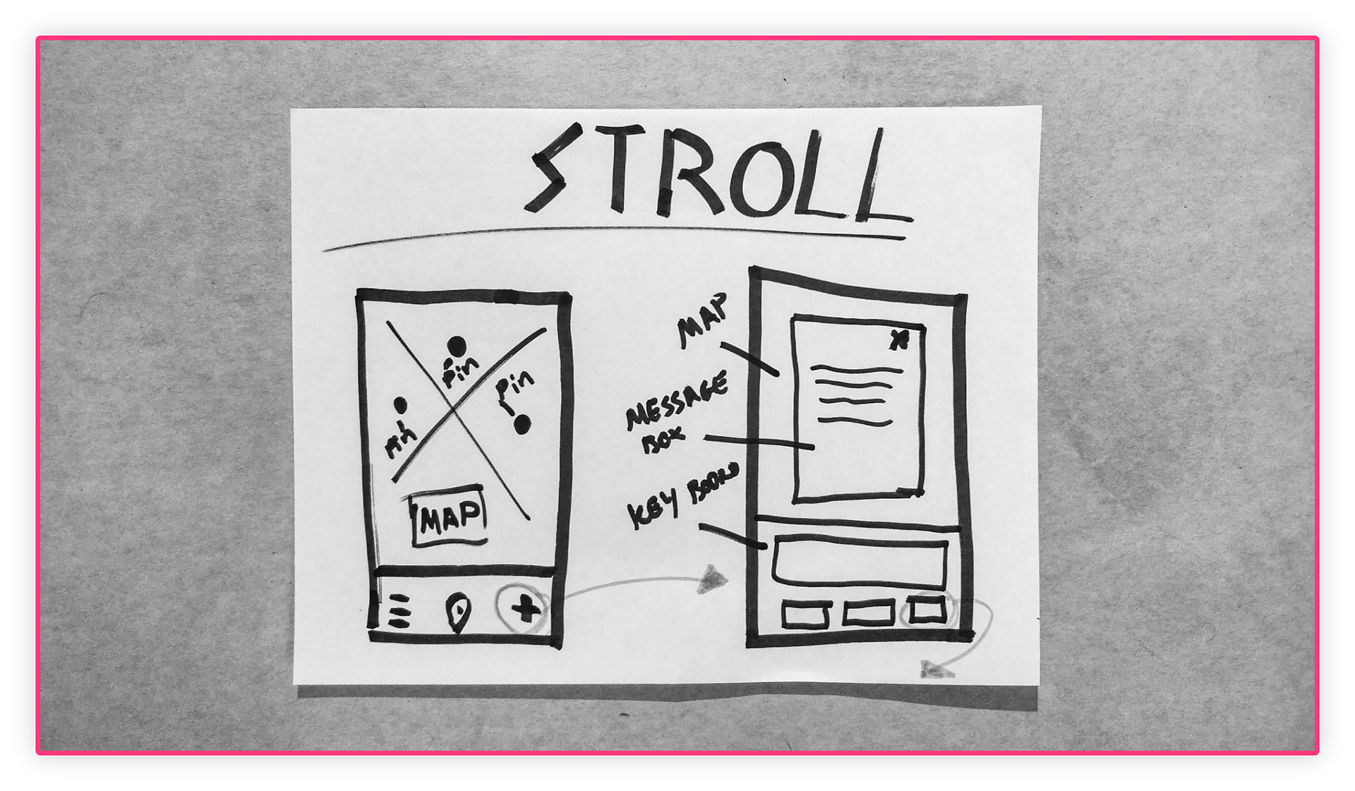
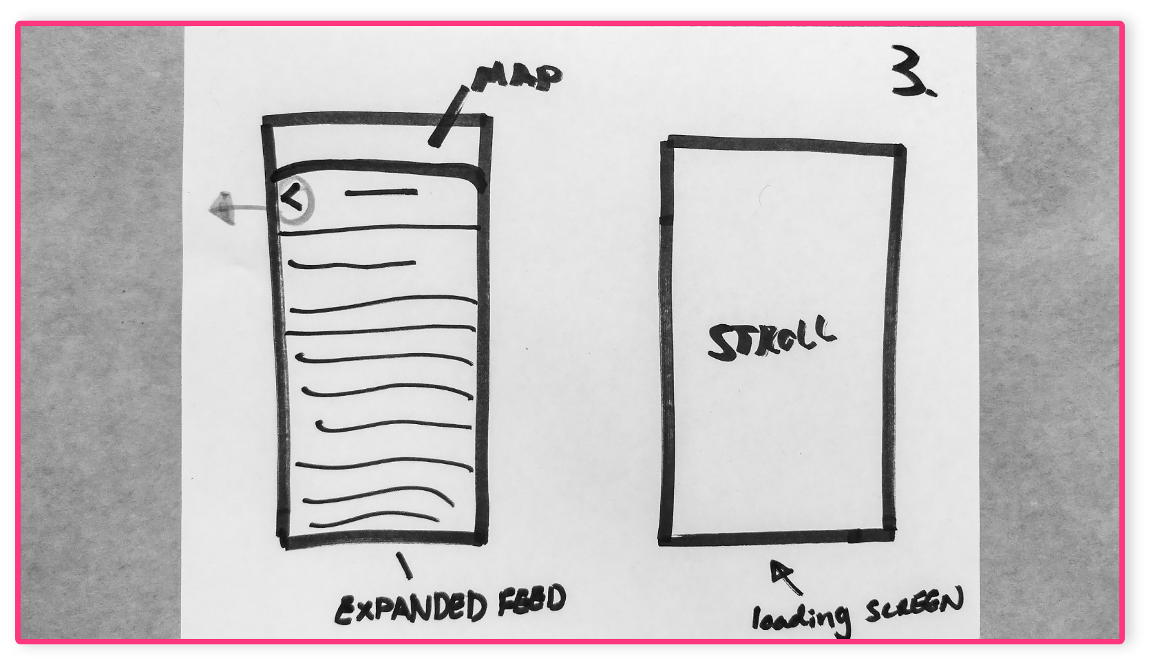
Sketches
These sketches were drawn as quick ideas for potential solutions to the problems we identified. sketching allowed me to quickly iterate ideas using minimal tools that saved time.
The sketches to the right show the final idea for our minimum viable product.
The sketches to the right show the final idea for our minimum viable product.
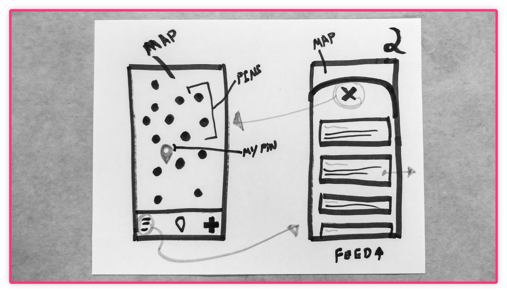

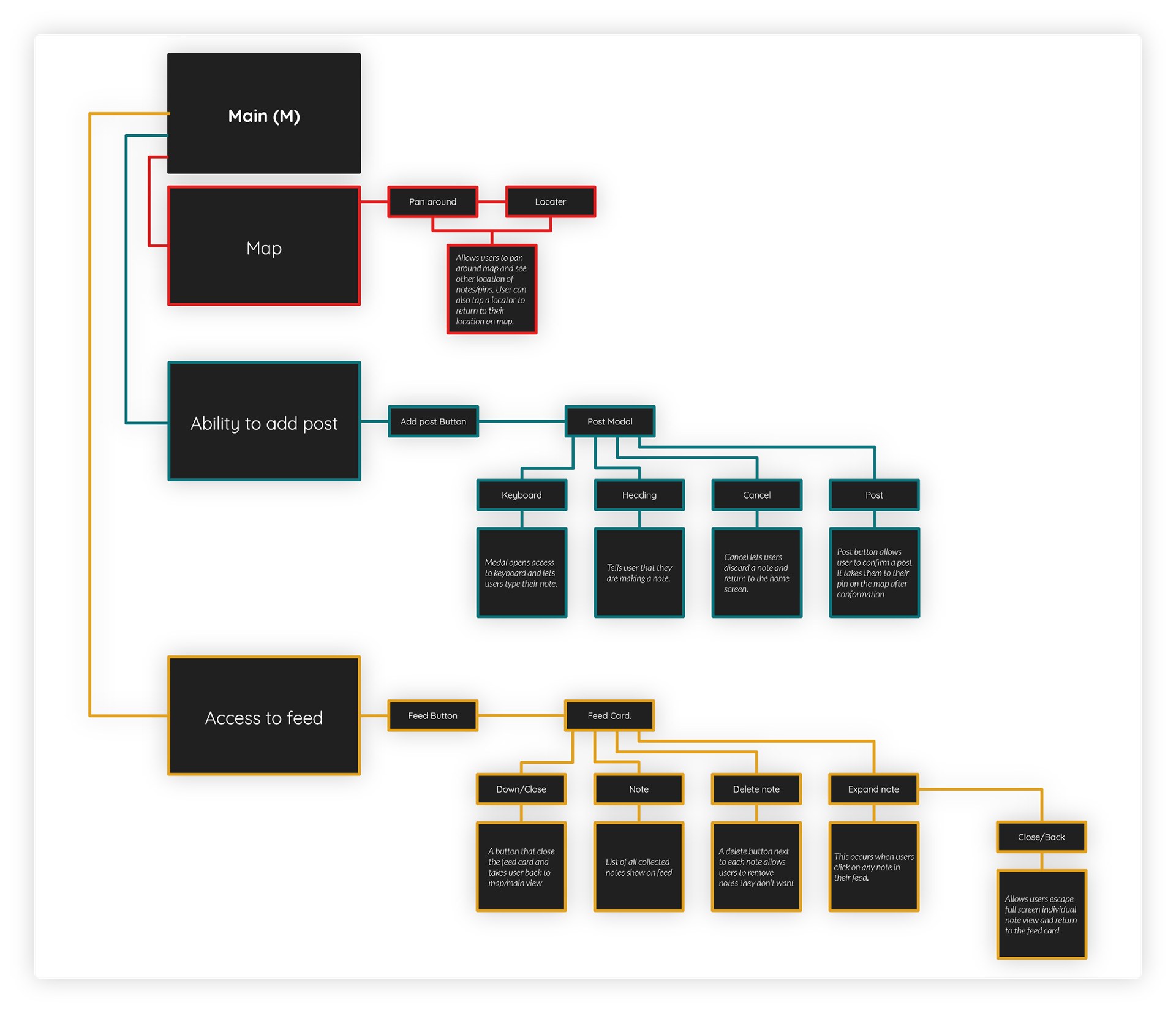
User Flow
The user flow I designed illustrates how our users complete various tasks within the Stroll app, it also shows how each step relates to another. By building this user flow, I was able to identify which steps could be eliminated as well as what steps could be added or improved. This is the final user flow that I created after presenting different versions we came up with through iteration.

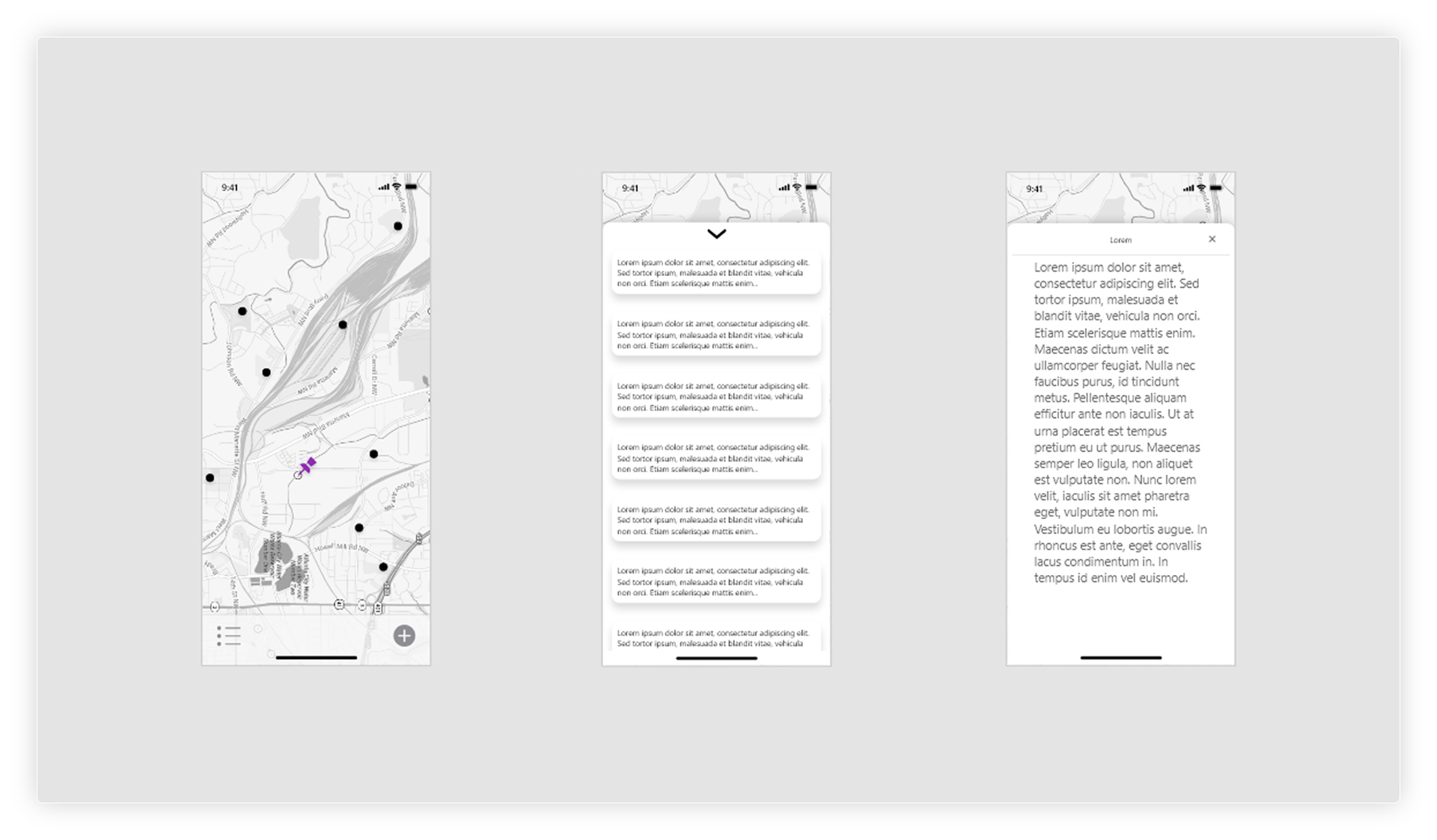
Wire-frames
The wireframes I designed were created to arrange elements in a way that accomplished a particular purpose. Each of the various wireframes show page layout, arrangement of the apps content, interface elements, and navigational systems.
The wireframes to the right are the final wireframes I created. Because of our tight timeline we only create a few wireframes before moving forward.
The wireframes to the right are the final wireframes I created. Because of our tight timeline we only create a few wireframes before moving forward.


A chance to connect with every note. A public map allowed users post notes to a specific location, crossing paths with notes built meaningful feeds.
We attempted to solve our target audiences problems by designing an app that allowed them to create location-specific content in real-time. They could do this by posting notes to a community map, these notes could later be collected as content when users crossed paths with them. The map was a core feature within the Stroll app, it allowed users the ability to post content to a specific location and share it with other people nearby. This was important because it allowed users to build feeds that were relevant to them & their location.
Notes in themselves we're also a key feature, they were the type of content a user could create, a note could contain just text but eventually, we added support for images, notes always appeared on the map in the location that they were created. Finally, the feed stored notes as user crossed paths with them. To cross paths with a note users had to come within a specific radius of that note’s location on the map in real life. The purpose of each of these features was to aid users in collecting meaningful content in real life that would facilitate the building of genuine connections.
Notes in themselves we're also a key feature, they were the type of content a user could create, a note could contain just text but eventually, we added support for images, notes always appeared on the map in the location that they were created. Finally, the feed stored notes as user crossed paths with them. To cross paths with a note users had to come within a specific radius of that note’s location on the map in real life. The purpose of each of these features was to aid users in collecting meaningful content in real life that would facilitate the building of genuine connections.

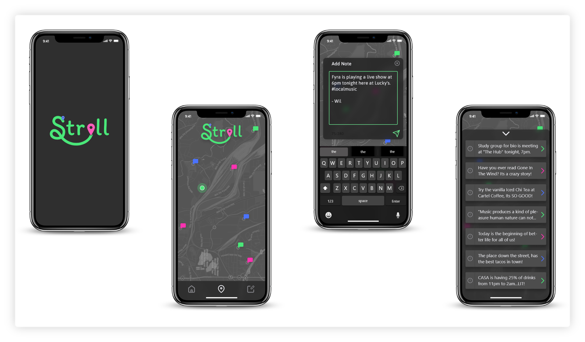
The Final Design
To the left is the final design for the Stroll app. I arrived on this design after testing our wireframe with users. This particular design is a hybrid between apple human interface guidelines and google material design. I looked to these resources because they have been tested and proven to generate positive results.
VIEW PROTOTYPE
VIEW PROTOTYPE

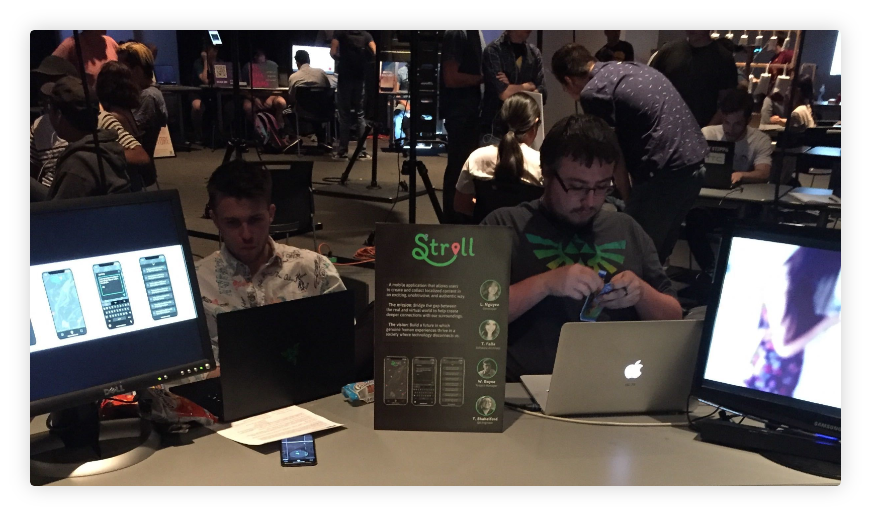
Video Documentation
This video provides in depth documentation of our entire development process, it also showcases highlights from our capstone presentation.

6. The Results
We launched a robust MVP. However, better research and user testing would have made a
world of a difference.
world of a difference.
We are no longer working on Stroll however, we are proud of the fact that we were able to launch a fully functional and testable MVP in under a semester. Following the testing we conducted at the showcase we walked away with a few insights that led us to the following features: User accounts were a must. Such a feature is important for it would have allowed for better moderation as well as better protection of user data. This is crucial as Stroll tracked users’ locations, which is arguably sensitive personal information. Video integration was important, as it would have offered users a more personal experience and had the ability to enable greater forms of expression. Implementing these features may have allowed Stroll the ability to compete more effectively with larger tech companies
because the user experience would have been more familiar, interesting, and addictive, this also may have increased the retention rate. Other features requested by users include the clearing of notes from the map after 24 hours, this would have improved the app, not only by keeping the map clean but also by keeping the content fresh while also adding a feeling of exclusivity to each note. Stroll was positively received by faculty, staff, & students. It effectively met as well as surpassed the goals we set for the project at the beginning of the semester. The number one thing we could have done to improve was conducted more market research and user interviews to gain greater insights into the problem, doing so would have helped us build better more robust product.