Project Overview:
This project was done while working on the Mood app. The original form only allowed users to upload a song and name it. As we grew we needed more information. This form was designed to collect it in a simple way. Throughout this case study I will outline best practices for form design.
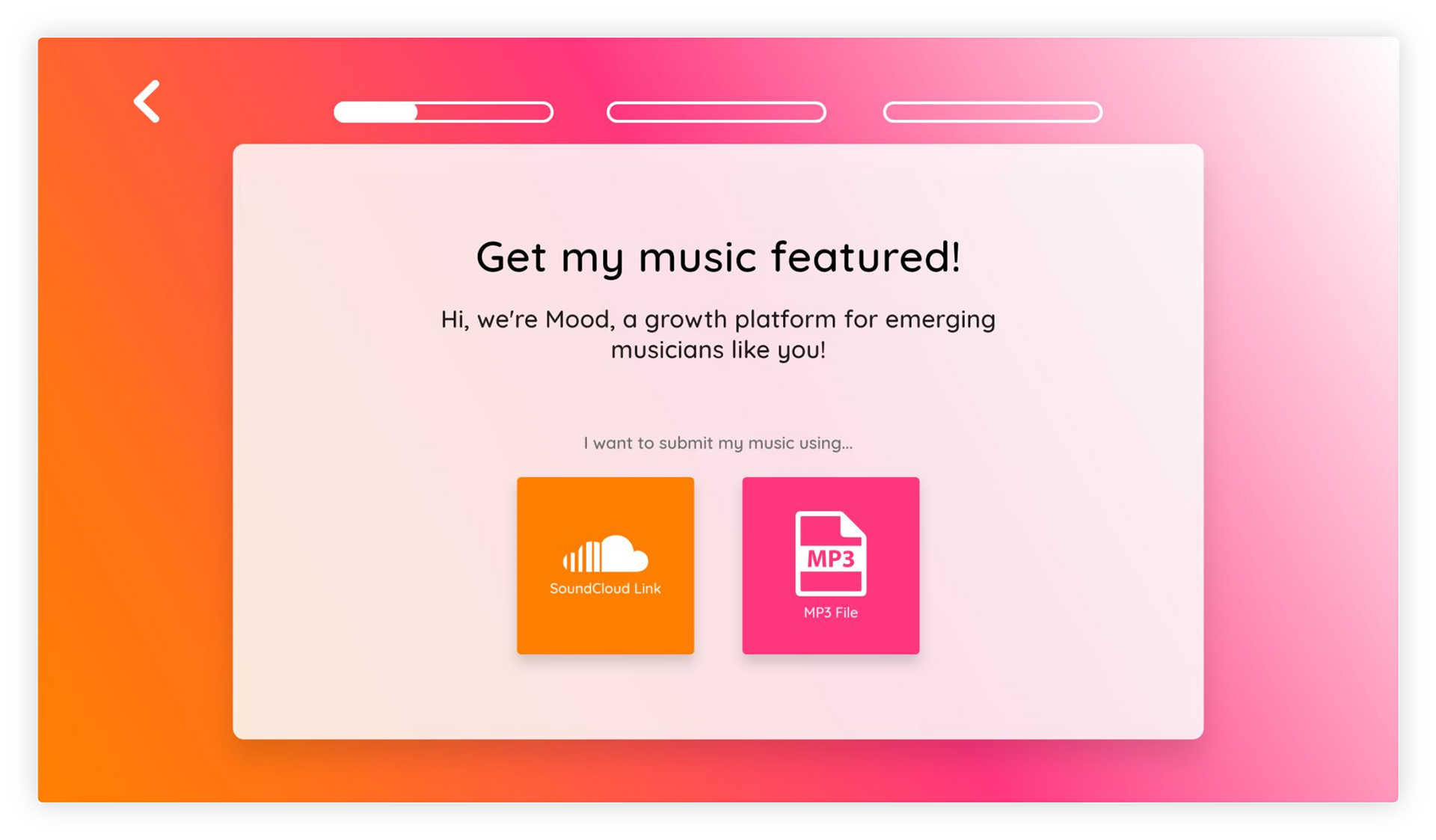
The first page to the left starts a conversation and motivates the user to continue filling out the form by showing them they've already completed a little bit of it. It also empowers their personal agency by letting them decide how they want to upload their music. Each decisions decreases form abandonment.

Unique Solution:
There were no immediate issues with the original form. However, it did not collect all the information we required when taking song submissions. I solved this problem by designing an extremely user-friendly form and submission process.
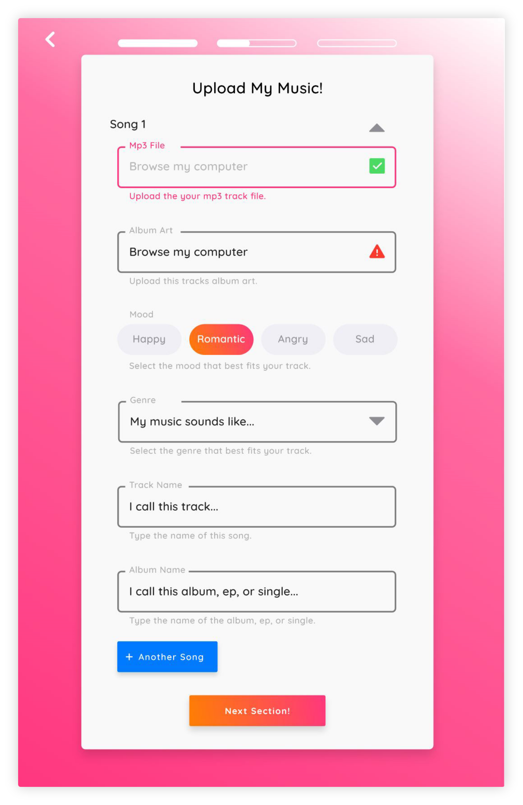
At the top of the form there is a title, this lets the user know what section they are on within the form. Above the title are the progress bars which animate as users move through the form, they also motivate the user to continue & simultaneously let them know how close they are to completing the form. The closer a user feels to being done the more likely they will feel a need to finish.
Input fields become highlighted when selected. On relevant fields indicator icons communicate to the user whether or not their input is valid. Radio buttons are used to help users select the mood of there music while also ensuring they only select one of the four moods.
When there are more than four options for a user to choose from and only one can be selected it is best to use a drop-down. The genre input is an example were a dropdown has been used correctly, when active it provides a list of 12 genres users can select from to classify their upload.
At the end I include an add another song button and a continue to next section button. The placement of the add another song button is important because it allows users to easily add another track to their submission without starting the process all over. This improves form completion and reduces frustration.
When another song is added, the first song and any information stored within it closes like an accordion and can easily be reopened to edit information using the triangle next to the title of the upload.

The Brief:
Build a form that ensures completion while collecting a large amount of information simultaneously.
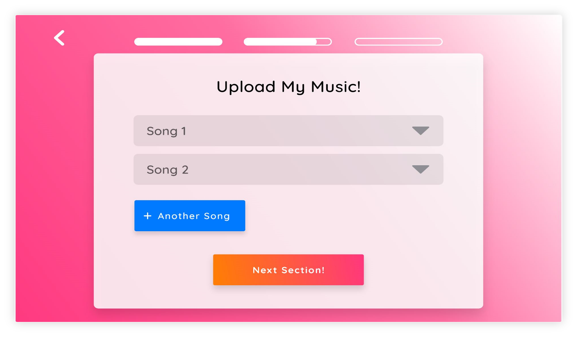
To the left you can see what the form looks like after more than one song has been added. Before moving to the next section users have a chance to review their submissions or add another song. Reviewing a song is easy, all user a has to do is expand one of the songs they added, when done close it & move on.
To the left you can see what the form looks like after more than one song has been added. Before moving to the next section users have a chance to review their submissions or add another song. Reviewing a song is easy, all user a has to do is expand one of the songs they added, when done close it & move on.

The Challenge:
To solve the problems with our old form and overcome challenges required by the new form, I designed an experience that created a friendly/helpful conversation and built trust with users all while motivating them to complete the form.
I created a friendly conversation by making labels in input fields ask relevant and engaging questions, the conversation was also helpful because I provided users with actionable assistive text. The positive feelings created by this conversation were crucial in building trust early on.
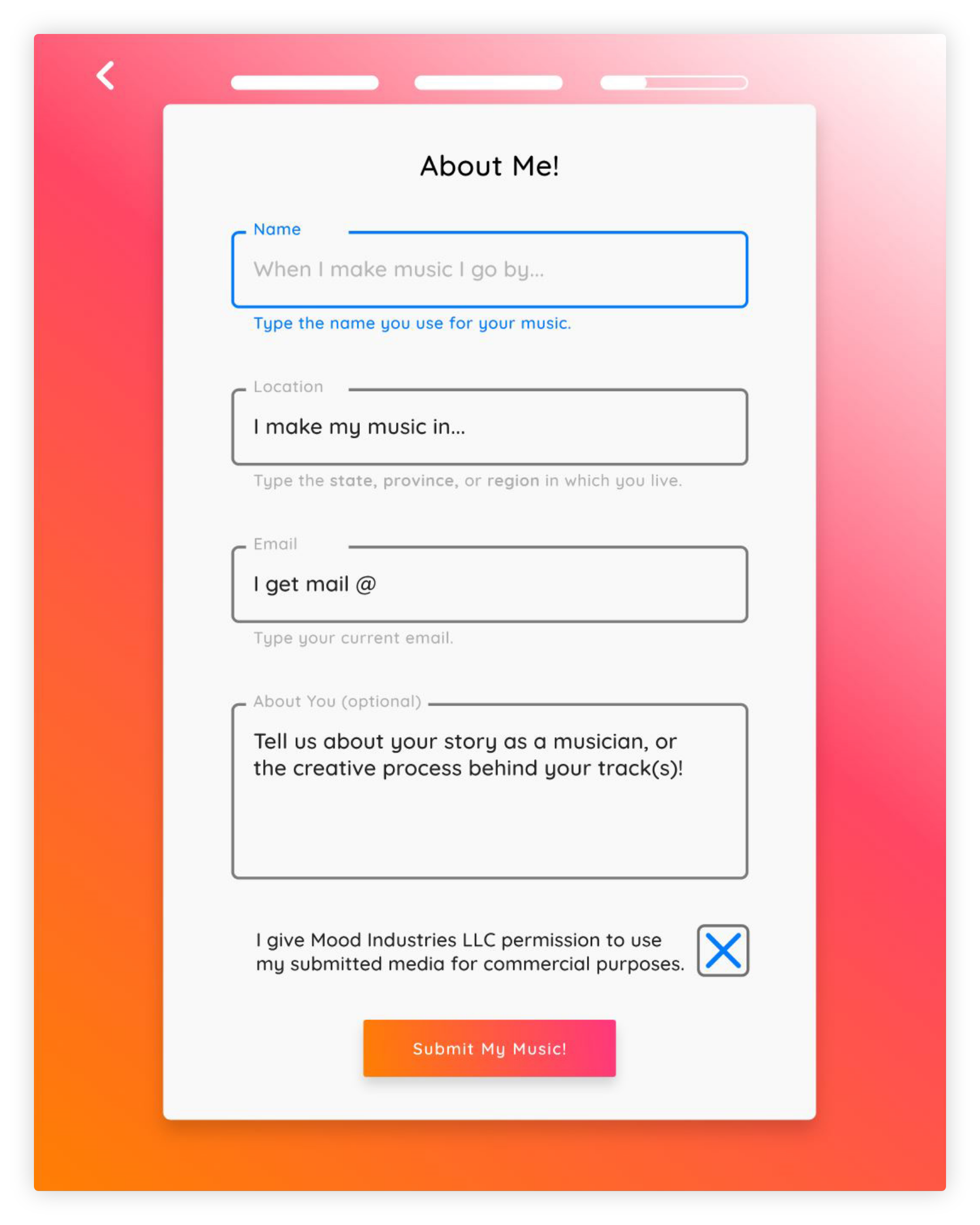
To further build trust I made sure that the most personal sections of the form came at the end after users provided less confidential information. To the right, you can see an example, I ordered input fields from least to most personal. The purpose behind decisions like these is to utilize the foot-in-the-door theory found in social psychology. Give someone what they want, ask them for a small favor and they will be more likely to do what you want.
The final way I built trust was specific to musicians. They were giving us their work, therefore it was important that they still felt like they owned it after submitting. To do this I made the description on every input field first person and ensured every title was about them. Finally I saved the big ask for the end because they would be more likely to commit to it after they'd already done all the work up front.
I created a friendly conversation by making labels in input fields ask relevant and engaging questions, the conversation was also helpful because I provided users with actionable assistive text. The positive feelings created by this conversation were crucial in building trust early on.
To further build trust I made sure that the most personal sections of the form came at the end after users provided less confidential information. To the right, you can see an example, I ordered input fields from least to most personal. The purpose behind decisions like these is to utilize the foot-in-the-door theory found in social psychology. Give someone what they want, ask them for a small favor and they will be more likely to do what you want.
The final way I built trust was specific to musicians. They were giving us their work, therefore it was important that they still felt like they owned it after submitting. To do this I made the description on every input field first person and ensured every title was about them. Finally I saved the big ask for the end because they would be more likely to commit to it after they'd already done all the work up front.


The Results:
The launch of the form was effective in helping us gather more information without negatively affecting the average number of song submissions per week.
To the left is the end of the form, it displays a positive message that verbally rewards the user for their completion, it also lets them what is next and gives them the opportunity to easily upload another song.
*Important note. The form used auto formatting where necessary, for example the location input. It also utilized real time saving that way users could go back and forth between form sections to make edits. without having to restart.