1. Problem Statement
Young women are unable to reliably request help in situations that threaten their safety.
2. Users & Audience
Young women in high school, college, and workforce living in urban and city settings.
3. Roles & Responsibilities
Lead user experience and user interface designer tasked with core app/website design.
4. Scope & Constraints
Build, launch, test, and iterate an MVP with an extremely small budget in under 3 months.
5. Our Process
Design thinking merged with lean methods and an agile development approach.
6. The Result
Launched a successful MVP, that is loved by past, current, and new users.
1. The Problem
Situations that threaten a person's safety are unpredictable. Flaire makes getting help thoughtless.
Thousands of young women across the nation find themselves in uncomfortable situations every year. Each experience is different, calling the police, notifying a friend, or screaming for help is not always the best or easiest option. Flaire makes getting help both simple and possible in any situation; Simply say your codeword, draw a gesture on your smartwatch, or press a big red button to signal for help.
2. The User & Audience
Young women living in urban or city settings and are highly concerned about their personal safety and the personal safety of their friends.
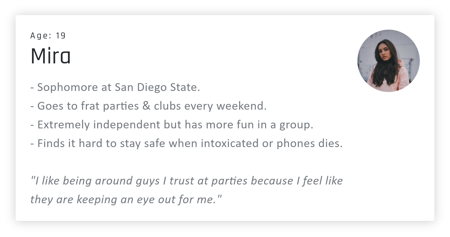
There are many different activities that our target audience engages in. Some go out to clubs and parties every weekend while others enjoy the occasional afternoon trip to the farmers market. Nonetheless, both individuals are concerned about their personal safety and their ability to quickly request help based on the circumstances of the situation they find themselves in.
Sample Personas

3. My role & responsibilities
An idea born out of the difficulty & frustrations women experience when in need of help.
The idea for Flaire was brought to us by two University of Colorado Boulder students. Their goal was to stop threatening situations by getting people the help they need in any situation. Throughout the creation of Flaire I focused most of my efforts on user experience and interface design. As part of my process, I focused on conducting user research, identified challenges and pain points, facilitated the ideation process, drafted sketches, user flows, wire-frames, & high-fidelity prototypes. Nick another designer focused on branding and graphic design while Zach focused on the development of Flaire.
4. The Scope & Constraints
Flaire was a unique startup in need of a serious facelift that had to move from an idea to reality rapidly.
Flaire has been regarded as innovative by the state and the University of Colorado. Our mission was to further the use of technology as a means to increase personal safety. We pursued this goal by designing and building a digital product that used voice & gesture technology to quickly, discretely, & reliably notify first respondents. The contract we accepted gave us three months to achieve the mission without exceeding our client's small budget. To accomplish this we built a product backlog in Trello that clearly defined the scope of the project. Our backlog also acted as a road-map we referenced every two weeks during our sprint reviews to confirm whether or not we shipping deliverables on time.
5. My Process
We conducted user research and found our audience needed to signal for help effortlessly in any situation that compromised their safety.
User Surveys
We kicked off the development process with user surveys. The goal of these surveys was to collect quantitative and qualitative data that would yield statistical insights we could evaluate to uncover problems and pain points faced by young women. Our primary audience for these surveys were college-aged women concerned about their safety. We conducted these surveys by sending them to sororities who shared the surveys with other students. Questions on our survey were intended to provide us with psychological and demographic information concerning our target audience. We had a total of 44 respondents who all responded similarly to the various questions asked.
Interviews
We interviewed people directly from our survey and conducted the interviews over video chat. The purpose of these interviews was to learn about the needs and problems of our target audience. We achieved this by asked a question like: “How do you stay safe when you are alone at night?” The purpose of questions like this was to gather insights into how our target audience currently tries to stay safe. We also asked questions like "Would you be willing to describe a time when you felt unsafe?" The goal of this question was to better understand the issues and pain points our users experienced with their current solutions.
Every situation is different. People at risk have to embrace a one size fits all solution.
Young women are currently embracing a verity of different solutions to protect themselves from potentially threatening situations. These solutions range from techniques that do not embrace technology to those that do. While each of these varying approaches increases safety Flaire combines many points of help with quick activation.
Flaire had a few competitors, none of them quickly, reliably, and discretely helped users notify emergency contacts in threatening situations.
bSafe allows users to receive SOS alarms when loved ones are in trouble. Circle of Six is designed for college students to prevent sexual violence. UrSafe is a hands-free, voice-activated personal safety app. Noonlight allows users to trigger an alarm by clicking and holding a button. The issue with each of these services is that none of them offer more than one point of help or give the user ability to request help in a way that is intuitive or appropriate for the moment.
The unpredictability of certain situations makes me feel unsafe.
I wish I had a way to feel comfortable in any situation.
“Parking garages make me nervous, I always walk with purpose and get in my car quickly and lock the doors and leave right away rather than sitting there”
“When I feel unsafe I usually call someone or remove myself by getting an Uber or finding someone I know.”
“At night I always am on alert, have my phone on me, make sure someone knows where I am or that I have shared my location”
We discovered the largest pain point faced by young women is how difficult it can be to think clearly in threatening situations that cause anxiety and fear. Many wished that they could instantly disappear or that could press a big red button for help. Our goal was to make it effortless to request help in any situation.
Empathy Map
The empathy map we created was designed to visually display the knowledge we gained from our users through interviews & surveys. By building this empathy map my team and I were able to better understand and visualize the needs of or users through their emotions and behaviors.
Below is a digital version of the user journey I created as my team and I moved through our design sprint.
Below is a digital version of the user journey I created as my team and I moved through our design sprint.
Sketches
These sketches were drawn as quick ideas for potential solutions to the problems we identified. sketching allowed me to quickly iterate ideas using minimal tools that saved time.
The sketches to the right show an idea for the minimum viable product. The sketches below explore various ideas for different flows in the app.
The sketches to the right show an idea for the minimum viable product. The sketches below explore various ideas for different flows in the app.
User Flows
The user flow illustrates how users complete various tasks within Flaire. It also shows how each step relates to another. By building this user flow, I was able to identify which steps could be eliminated, added to, or improved.
VIEW USER FLOW
VIEW USER FLOW
Wireframes
The wireframes were created to arrange elements in a way that accomplished a particular purpose. Each of the various wireframes depicted page layout, arrangement of the apps content, interface elements, and navigational systems. They also allowed us to quickly test various solutions with users.
VIEW WIRE-FRAME
VIEW WIRE-FRAME
Help is never more than a voice command, gesture, or tap away. User can easily & discretely request help in a loud & crowded bar, when they are alone in a parking garage, or any other threatening situation.
We made the process of requesting reliable help effortless through a few core key features. The first and most important feature is the codeword. When users sign-up for Flaire they are asked to choose a codeword which they can say to signal for help. We also created a big red-button that users can press to signal for help when they are in a situation that prevents them from saying their codeword. Other situations require you to act fast, we solved this problem by allowing users to signal for help by tapping a button on their lock screen or drawing a gesture on their smartwatch. In our user research, we also learned that many of our participants disliked current personal safety apps because their parents always had access to their location. This was important because people wanted to feel independent and like they were in control. We achieved this sense of control and independence by allowing users the ability to turn Flaire on and off, letting them decide when they want access to extra help. Finally, we ensured safety by sending a text and live location link to the user's emergency contacts & first responders whenever they "dropped a Flaire."
The Final Design
To the left is the final design for the Flaire app. This design was arrived upon after a large amount of user research. The design its self is built on top Google material design & is paired with custom design like the big help button.
VIEW PROTOTYPE
VIEW PROTOTYPE
Flaire Website
The website had two purposes, act as a splash/information page and as a place where a user could manage their payments and higher-level details related to their Flaire account.
Sitemap & Sketch
To the right is architecture and ideation that was used to create the final Falire website displayed above. The design of the website embraced much of the same process as the app. Onboarding process & account management system for our future enterprise clients.
6. The Results
We built an MVP that made life-changing impact.
Within three months we successfully rebranded and redesigned the "Party Favor" sexual assault prevention app to what is now Flaire, a platform, and tool that empowers safety. We received a warm welcome from young women and the University of Colorado, an indication that we were able to take a proof of concept and transform it into an exciting and viable solution. Although we exceeded the client's expectations, we have been told by users that they feel like we listened to them and addressed their concerns. As the Flaire app continues to grow we are excited to help iterate upon it as we learn more about how the app is used.
